CSS Challenge
Challenge Description 📝
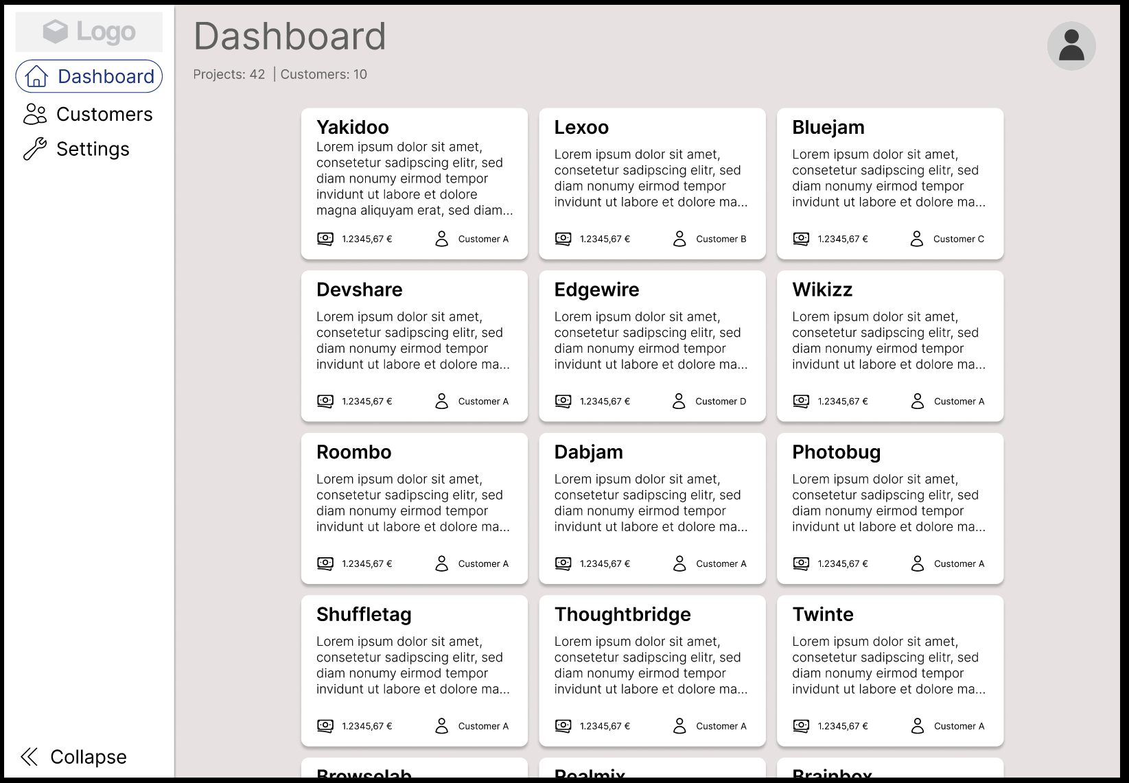
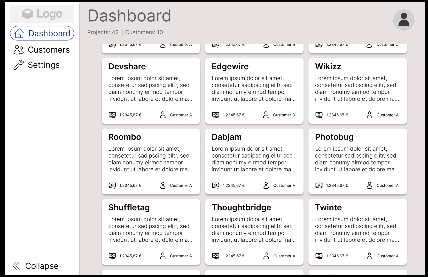
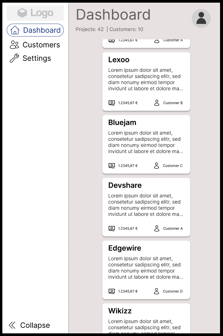
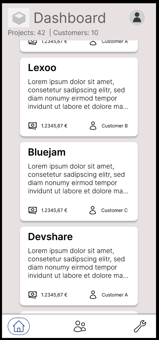
Your mission is to replicate a Figma design, focusing primarily on the structural elements such as the expandable menu bar, the sticky navigation bar, and the responsive grid. We're interested in seeing how well you can interpret and translate the design to a functional webpage using HTML and CSS.
The details like typography, color, and spacing aren't the main focus here; instead, we're looking at your understanding and implementation of key UI/UX elements in both desktop and mobile views.
You have the freedom to use plain CSS, or leverage processors like SASS/LESS or even UI frameworks like Material UI or Tailwind. What we value is your approach to incremental problem-solving - so commit often, showcasing your progress and thought process.
For testing, make sure your solution looks great and works seamlessly in various environments by using tools like Chrome Dev Tools, and don't forget to check out how it appears on your smartphone too. Happy coding! 🚀
Challenge Requirements 📜
-
HTML/CSS: You're required to use HTML and CSS for this challenge. You can use pre-processors like Sass or LESS if you'd like.
-
Figma File: We're providing a Figma design file (opens in a new tab) for you to implement. Make sure to inspect the file closely to understand the design's details.
-
Responsiveness: The design needs to be responsive and work well on different screen sizes, from mobile devices to desktops.
-
Browser Compatibility: Your implementation should be compatible with the latest versions of Chrome, Firefox, and Safari.
Screenshots


Steps to Complete 🐾
- Inspect the Figma design and plan your HTML structure and CSS styles.
- Write the HTML and CSS. Test your page on different screen sizes to ensure it's responsive.
- Test your page in different browsers to check for compatibility.
- Document your work: Explain your choices and any difficulties you faced in the README.
Definition of Done
For completing this challenge, please ensure that you meet the following requirements:
- Your HTML/CSS looks similarly to the Figma design and is responsive on different screen sizes.
- A
README.mdfile contains a short description and explanation of the main aspects of your chosen approaches.
As soon as you have finished both other challenges, please submit your solution in our [online form](https://tally (opens in a new tab). so/r/w5jbp6).
Evaluation Criteria 🪄
We will evaluate your work based on the following:
- Design: How accurately your implementation represents the Figma design.
- Responsive layout: How well your page adapts to different screen sizes.
- Code quality: We're looking for clean, readable, and well-structured HTML and CSS.
- Problem solving: Remember, we're not just interested in the final product - we want to see how you got there. Commit early and often, with clear and informative commit messages.
Best of luck with the challenge! We're excited to see your creative solutions. 🚀